Bridging the
hard and the
soft
a point where two systems, subjects, organizations, etc. meet and interact.
User interfaces (UIs) are the connections between us —
Historically, these interfaces have been rigid, representing the deterministic logic of the machine and relying on the user to translate the hard logic into a soft, meaningful form. With the rise of LLM capabilities, our technology is newly better at acting soft and squishy. Which brings the question: how should our interfaces handle the transition from the hard logic of machines into the soft logic of humans?

Bridging materials of different types is hard to do well. Think of where a prosthetic limb meets the body — it needs to take advantage of multiple materials, bespoke engineering, and careful design to join the hard metal to the soft body.
Note that we don't want to completely replace the deterministic logic of our machines with the squishy logic of our humans.
On the other hand,
But too much softness can be problematic. Consider ChatGPT. While it's incredibly flexible and can be used for a wide range of tasks, it can feel
But this isn't a rant about chatbots. Instead, let's explore how we might bridge the two materials.
How does nature do it?
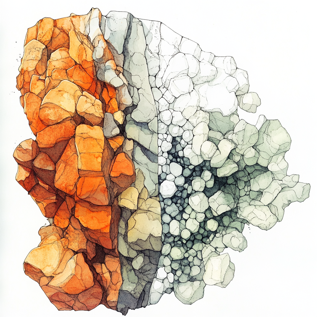
Nature has some clever tricks up its sleeve when it comes to bridging hard and soft materials. Here's one strategy:

For example, our spines are made up of hard vertebrae separated by soft discs. This segmentation allows for rigidity where it's needed (under compression) and flexibility (torsion) in other directions. By distributing forces along its length, the segmented structure prevents stress concentration at any single point.
And this segmentation happens across vastly different scales!

Microscopic Scale
Cells
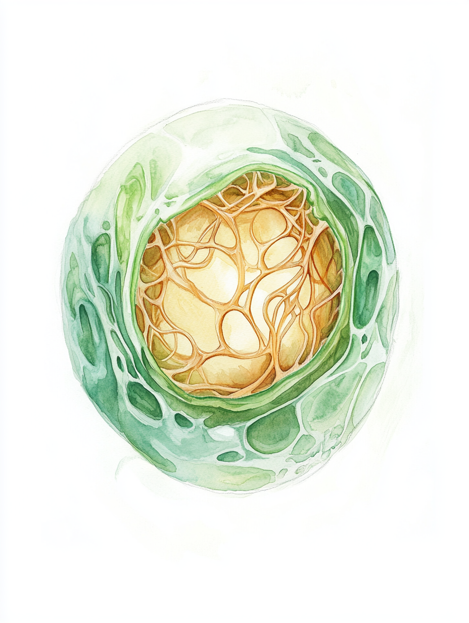
At the cellular level, cell membranes are soft and flexible, allowing cells to change shape and interact with their environment. Inside the cell, the cytoskeleton provides structure with its network of rigid protein filaments.

Human Scale
Muscles, tendons, and bones
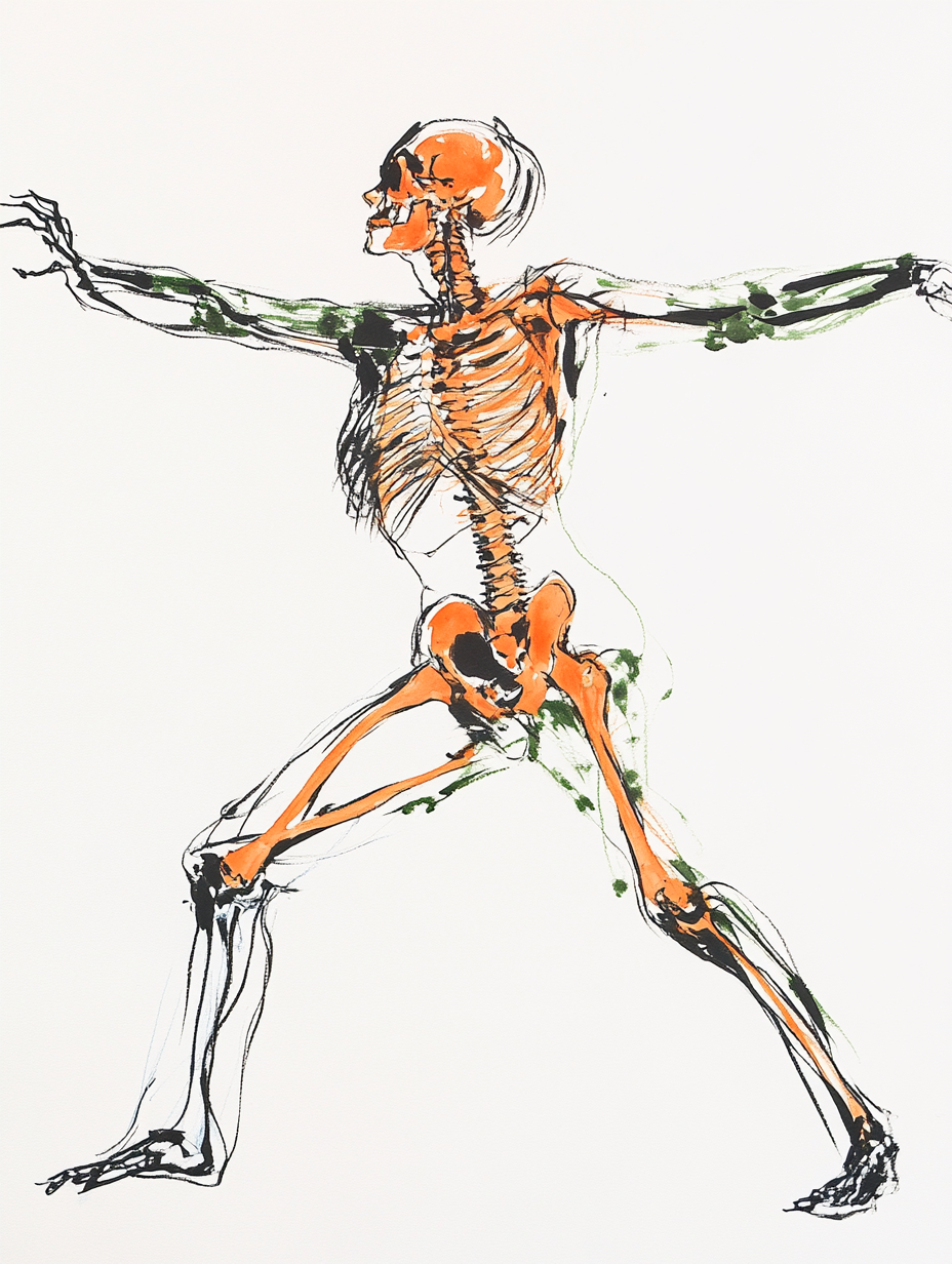
Our bodies are a blend of soft and hard tissues. Muscles are soft and enable movement, tendons are tougher and connect muscles to bones, which are hard and provide structural support.

Planetary Scale
Tectonic plates
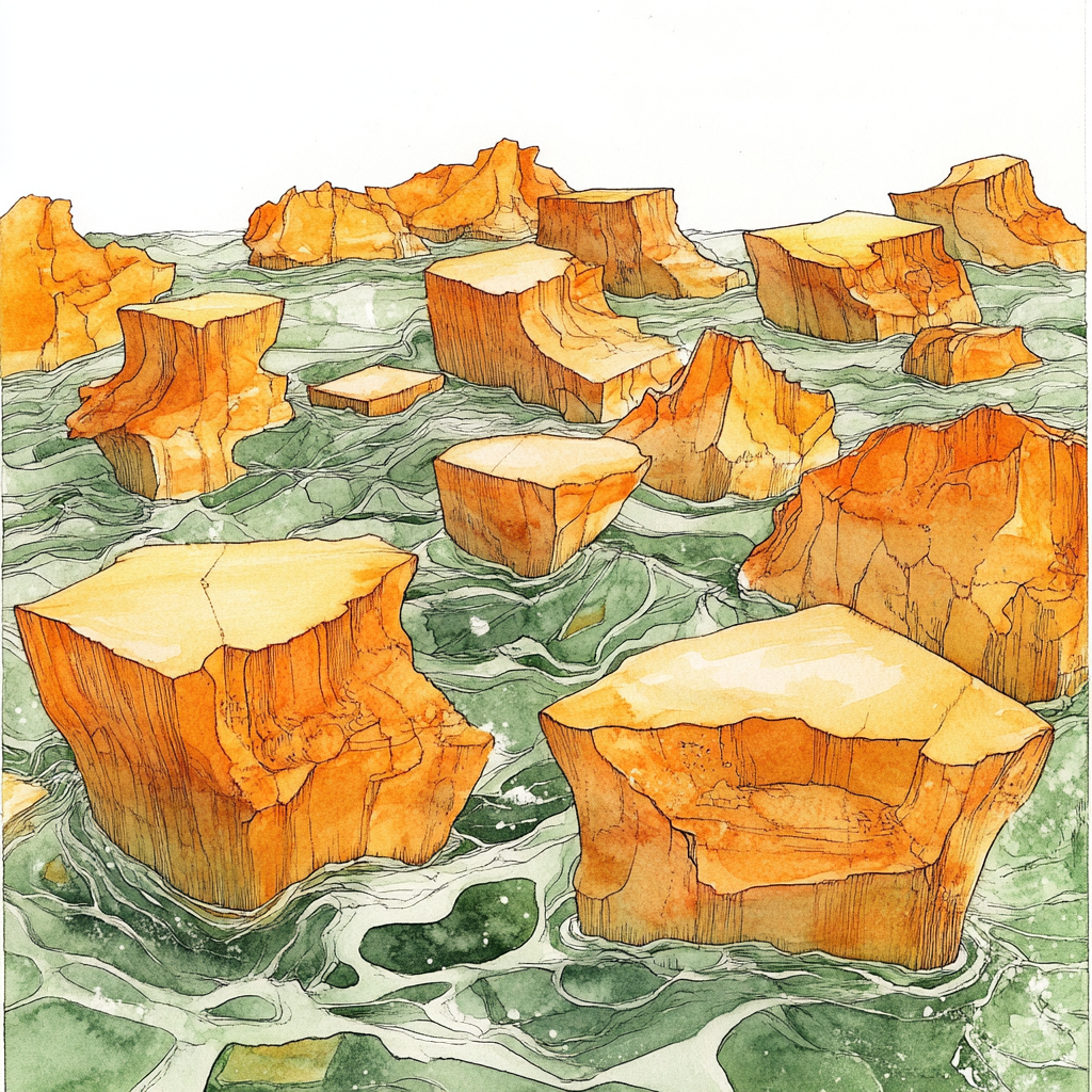
On a much grander scale, tectonic plates are rigid slabs of Earth's crust floating on the semi-fluid mantle beneath. The plates are hard and stable over millennia, but the softer mantle allows them to move and reshape the planet's surface.
So how might we use LLMs to fluidly connect modular segments across different scales of interfaces?

At the smallest scale, we have the content on a page: text, images, icons, and styles. These are each made up of hard-coded letters, numbers, svgs, pixels, etc, that an LLM arrange to generate new content on the fly. This level is the most flexible, allowing for a huge range of expression. Imagine: ChatGPT generating new text to respond to a user's message.
One level up, we have the primitive components of a web page. Things like buttons, sliders, text inputs, and so on. These primitives can be pulled in where appropriate to help the user interact with the page. Imagine: a generated menu with relevant actions based on what the user is doing.

Meeting next week
Just a heads-up, we've got a meeting next Tuesday at 9 that we should prep for...

Hogwarts Acceptance Letter - Late Admission
We regret to inform you that due to an unfortunate incident involving a time-turner...
 Dumbledore

Jurassic Park Employment Opportunities
Exciting positions available at Jurassic Park! Seeking fearless individuals for roles such as Velociraptor Wrangler, T-Rex Dental Hygienist, and Emergency Evacuation Coordinator. Must love dinosaurs...
10:30 AM this morning
Up another level, we have pre-made blocks of primitives. These carry more structure and meaning, building on users' existing knowledge of interfaces. These blocks can be pulled in where needed, building whole sections at once. Imagine: A list of emails, each of which is presented optimally for the content.

Meeting next week

Just a heads-up, we've got a meeting next Tuesday at 9 that we should prep for. Nothing too major, just your average "let's impress everyone with how prepared we are" kind of thing.
If you could pull together some materials based on the Meeting Prep doc and make us look like geniuses, that’d be great. No pressure—just our reputations on the line.
Let me know if you need anything (except a time machine).
Cheers, Gregathy


And at a higher level yet, we can construct the flow of an interface. How the user moves between blocks and sections. As a user is viewing an email, can we surface context to the side or open the related doc or calendar event? These flows can follow any type of layout algorithm: cards on a page, different pages, sections that stack horizontally, etc. Maybe even strewn about an infinite canvas.
Importantly, these different scales co-occur. We can use LLMs to generate content within blocks of primitives that are also generated on the fly. When we have specific, hard-coded modules that LLMs can utilize, we can generate more meaningful interfaces and to give the user solid ground to stand on.
Gradients along different dimensions
Here's another strategy that nature uses to bridge hard and soft materials:

For example, our skeleton starts with hard, rigid bones, and transitions to soft, flexible skin through a gradient of increasingly flexible materials: periosteum to tendons to muscles to fascia to fat to skin. The many layers help distribute forces and absorb impacts, protecting the skeleton while allowing for flexibility and movement.
Here are a few examples of how we might transition between different levels of hardness along different dimensions.
Familiarity
For new users, a
Imagine: A programming IDE that starts with a simple layout showing basic features. As you become more experienced, it allows you to integrate additional tools, autocompletes functions based on your coding style, and helps debug errors.
Open-endedness of tasks
When a user has a specific task to do, a
Imagine: A cooking app that provides a strict recipe mode with exact measurements and steps when you're following a recipe. Alternatively, it offers a creative mode where you can explore new ingredients and techniques to experiment with new dishes.
Part of the stack
The back-end is deterministic and
Imagine: A financial app where secure transactions are processed through a rigid backend system. The user interface, however, allows you to customize dashboards, analyzes your spending habits, predicts future expenses, and offers personalized budgeting tips through conversational interactions.
Physical context
When viewed on a smartwatch, a
Imagine: A project management tool that shows a concise list of tasks on your smartphone for quick updates. On your desktop, it expands into a flexible interface with drag-and-drop scheduling, detailed analytics, and team collaboration features.
Time pressure
When we're in a hurry, we want to get things done as quickly as possible. A
Imagine: A travel booking app that, when it detects you're in a rush (perhaps through time of day or calendar integration), presents a streamlined interface with quick-book options for frequent destinations or one-click reorders of previous bookings. When you have more time, the app transforms into an exploratory platform, offering personalized recommendations, moodboards, and interactive maps to help you discover new destinations and travel experiences.
Emotion and Cognitive Load
Users' emotional states can influence how they interact with interfaces. When overwhelmed, a
Imagine: A mental health app that detects signs of stress through typing patterns or wearable data. When stress levels are high, it presents a simple interface with quick access to calming exercises. When you're more relaxed, an integrated LLM offers personalized insights, suggests new wellness activities, and engages in supportive conversations.
Towards more humane technology
We're just scratching the surface of how interfaces might balance the